8 Ways Good Real Estate Website Design Can Boost Your Business
How to design your real estate website to maximize sales
Real estate marketing is constantly getting more sophisticated.
The pace of changes is breakneck.
The best websites now have marketing built into their very foundations.
And every month we seem to find one that is better than the last. It’s crazy.
To help you keep up we’ve put together a list of good real estate website design tips to boost your business.
HOMEPAGE SEARCH
The goal of your real estate website design is to attract visitors to your site and keep them there.
To do this you should strategically place interactive features across your site.
First and foremost is your property search.
Not much is more inviting than a picture of a beautiful property or family, a search bar, and the words “Find your home.”
This should be the most prominent feature on your real estate website home page. It should be the first thing a new visitor to your site notices.
Here’s a client we think does a good job with this: https://www.doorwaysteam.com/
Alternatively, you could place IDX results on your homepage. This will make your site seem dynamic and create a sense of urgency in your visitors. Your site after all is a place where homes are bought and sold regularly.
CALLS TO ACTION ON LISTING PAGE
Once a lead clicks on a listing you should encourage her to engage with it. Obviously a photo gallery is essential. But your website design also should include calls to action.
Request a viewing, contact agent, and social media share are good examples of this.
Notice that each call offers more information or a service for the lead.
INTUITIVE NAVIGATION
There’s is no need to reinvent the wheel with your real estate website layout. In fact it is encouraged that you not experiment here.
You want your site to be familiar to leads. They should navigate it with easy and intuition.
If information is hard to find or your site is confusing, they are likely to leave and not come back.
That’s potentially a lost sale.
Here’s a client who has kept navigation clean and simple: http://herrinre.com/ Nothing complicated here.
MOBILE RESPONSIVE
Wherever your leads go, you need to follow. In this case, it’s on mobile. According to NAR, more and more homebuyers are using mobile phones and tablets to look for properties.
And the usage rates for younger buyers are through the roof.
You should accommodate these new searches with a mobile responsive site.
This will speed up your load time on mobile browsers and make your site scalable so it fits on a mobile screen
NEIGHBORHOODS
We spend a lot of time on this blog writing about neighborhoods. It’s because we believe neighborhoods are a place agents can assert their expertise. Agents know their communities better than almost anyone and can use that knowledge to improve SEO and attract leads away from portals and syndicated sites.
Of course to have neighborhood content on your site, you need neighborhood pages.
PAGE SPEED
We all know how frustrating it is when a website won’t load. A slow loading page can push your leads to leave your site and never come back.
Obviously this is a huge problem. But slow page loads can have other detrimental effects. For example, search engines take note of load times, and limit your ranking if it takes too long.
Your design should be cleanly coded to minimize delays.
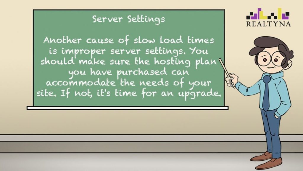
Luke’s Tip #1: Server settings

SHARE ICONS
The key to selling properties online is getting your site and listings in front of more people.
To do this you should make sure your design includes social media icons in important places.
If a lead sees a listings or blog post she likes, you should make it as easy as possible to share.
INVITATION TO REGISTER
Lastly you should encourage your leads to register to your site. A well-timed pop-up with exclusive information or an update can have a conversion rate of 2% to 7%.
Realtyna offers a registration pop up under our Membership Add-on. Under this feature, the options may be set to suggest registration or require it.
Now that you’ve heard our ideas, let us know what you think in the comments. Or contact us and we’ll take a look at your real estate website for a no-cost, expert evaluation.


Sorry, the comment form is closed at this time.